Realtime Analytics - User Documentation
Home ► Quick Access ► Realtime Analytics
Realtime Analytics
Overview
Realtime Analytics is a part of the website that allows to configure and visualize Wallboards (Dashboards). There is no limit on the number of Dashboards created within the Organization. However, only Org Admins can create, delete and/or configure Dashboards (also known as 'Views').
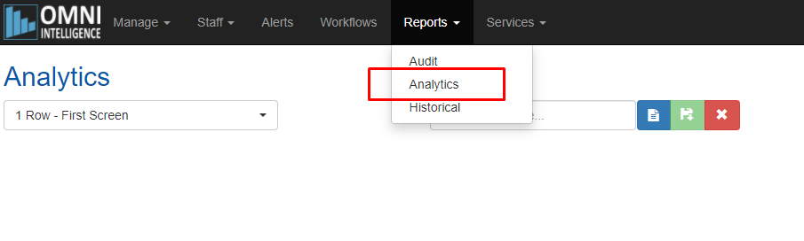
Dashboards are available immediately upon logging in as well as through the Reports->Analytics menu:
Realtime Analytics Data Fields
Click here to see full list of Real-time Data Fields and their detailed descriptions.
Managing Dashboards
Note: available for Org Admins only.
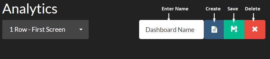
To create a new Dashboard:
- Click the blue 'New' icon
- Enter Dashboard name
- Click the green 'Save' icon
To rename a Dashboard:
- Select the Dashboard to rename using the top-left drop-down
- Modify Dashboard name
- Click Save
To delete a Dashboard:
- Select the Dashboard to delete using the top-left drop-down
- Click the red 'Delete' icon
- Click 'Yes' to confirm
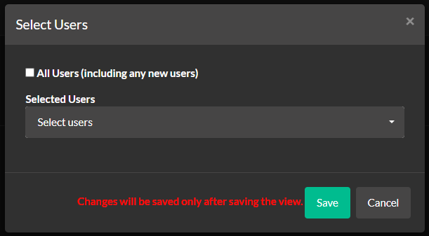
Dashboard access configuration
Note: available for Org Admins only.
Org Admins can nominate which users can access a Dashboard. To do so, select a Dashboard from the drop-down and click Permissions:

By default the Dashboard is accessible to all users. Uncheck the "All Users" check-box to select individual users that have access to the Dashboard.
For further details, Click here.
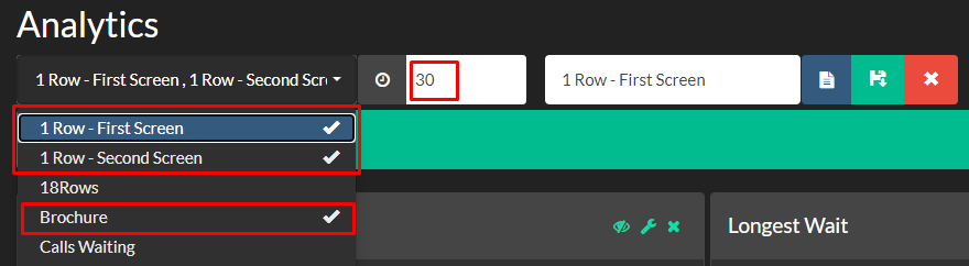
Dashboards Rotation
It is possible to have a number of Dashboards "rotating" periodically on the same screen (useful when multiple Dashboards should be displayed on a single screen). To do so, expand the drop-down, select multiple Dashboards (by clicking on them) and provide rotation period in seconds.
Example: the below figure provides a configuration which will rotate three dashboards every 30 seconds:
Further information can be found here.
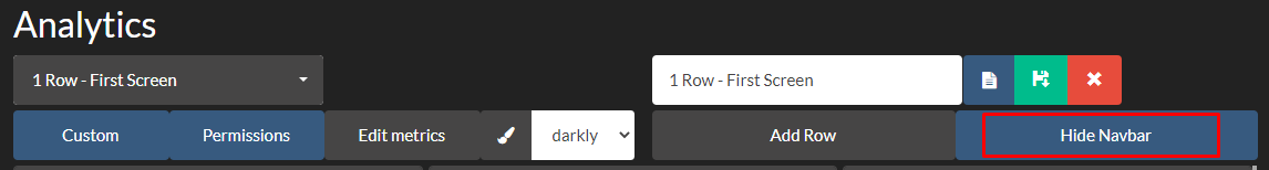
Full-screen Mode
It is possible to display Dashboards withiout any navigation bar and browser window borders. To enter the "full-screen" mode, click "Hide Navbar" then F11.
Note: check the "full-screen" mode with your browser; the majority of browsers support F11
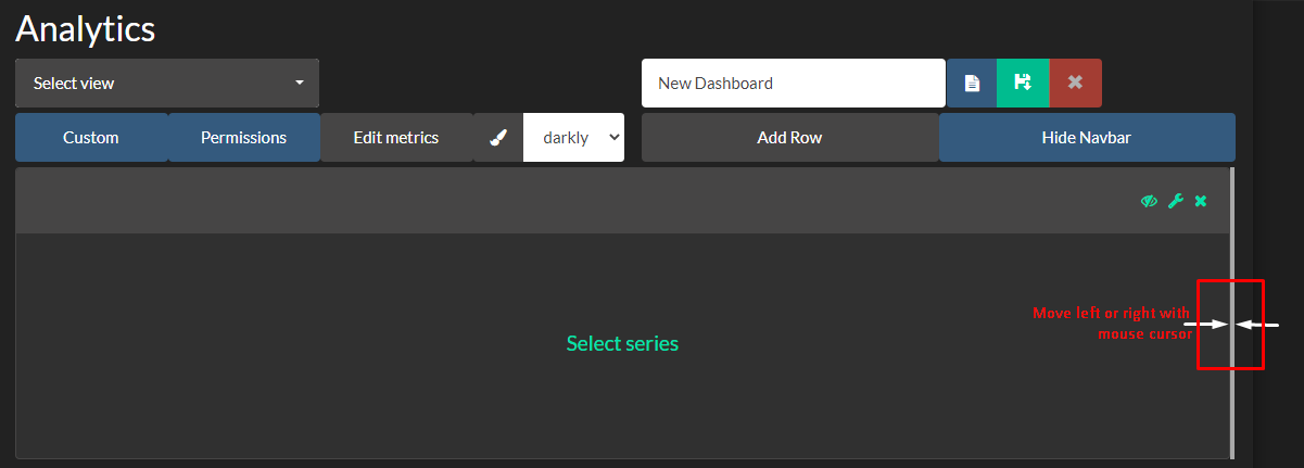
To exit the "full-screen" mode, press F11 again then move mouse cursor in the position as per the following figure:
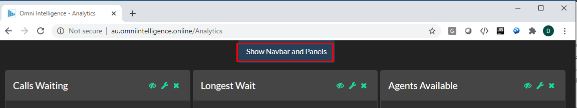
Click on the "Show Navbar and Panels" to bring view controls back to the original state.
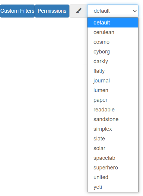
Colour Themes
There 18 various colour themes that you can use for your Analytics view appearance. Some may work better on plasma screens while some on desktop PCs. Colour scheme is applied immediately after the selection is made as per the following figure:
View settings such as rotation configuration and colour appearance are stored against each user. When the user logs in next time, the settings are automatically applied and no further configuration is required.
Configuring Dashboards
There is just one basic pattern to configure any kind of a Dashboard:
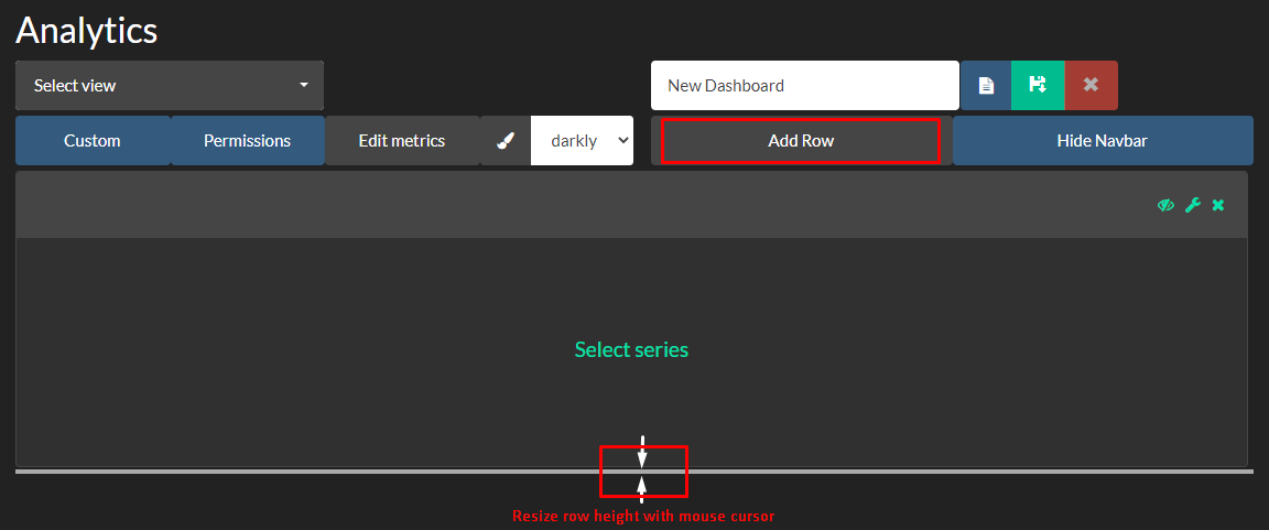
- Add and re-size rows
- Add and re-size cells inside of rows
- Define cell contents:
- Type cell header caption
- Choose cell content type (e.g. graph)
- Choose metric(s) to be displayed
Adding and re-sizing rows
Adding and re-sizing cells in a row
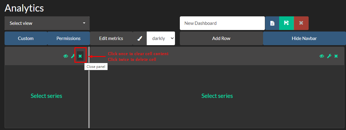
Deleting cells and rows
Content Types
Note: Click here to see full list of Real-time Data Fields and their detailed descriptions.
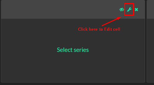
Cell content can be edited as per the following figure:
Choose content type of the cell from the drop-down list as follows:
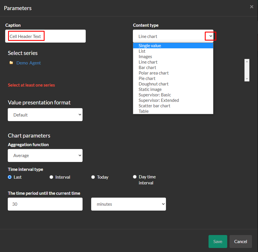
| Content type | Description |
|---|---|
| Single Value | Displays the most recent value of the selected data field in the cell. The value is scaled to fill up the whole cell |
| List | A basic list of selected data fields arranged in Filed\Value rows |
| Images | For fields which support image feeds (e.g. a webcam)* |
| Line/bar/polar/pie/doughnut charts | Graphical representation of data fields over a period of time |
| Static image | Displays a static image in the cell such as company logo |
| Supervisor: Basic | Shows basic agent information arranged in a list |
| Supervisor: Extended | Shows extended agent information with flexible sorting / filtration options as well as agent presence statuses |
| Scatter bar chart | Unlike the other types of charts, scatter chart presents data where X-coordinates of points are not evenly distributed; this type of chart is normally used for MPT scenarios where monitoring calls may arrive on different schedules |
| Table | Displays queue information in a tabular format. Supports thresholds and queues consolidation |
* Available only on demand, depending on the integration
Further information on content types can be found here.
Adding a Graphic Logo
A static image can be displayed in a cell such as a company logo. Details can be found here.
Adding a Table
A table which enables the display of multiple fields and multiple queues simultaneously can be created and viewed in a tabular format. Details can be found here.
Supervisor: Extended
The Supervisor Extended view enables the Agent Presence Status (reported from PureCloud) views to be filtered and customized. Details can be found here.
Tips
Automatic Log-on
A common procedure used by customers is setting up a large screen that automatically logs onto OI and displays an analytic screen. To set up an automatic log-on, Click here.